case study
C&O Canal Trust “Plan Your Visit” Redesign
CLIENT: C&O Canal Trust
This solo consulting project was completed as part of coursework for the MA/MBA Design Leadership program at Maryland Institute College of Art (MICA)
In Spring 2024, I initiated a pro bono design-thinking project with the C&O Canal Trust, the nonprofit philanthropic partner of the C&O Canal National Historic Park (NHP). As a longtime Maryland resident, I had enjoyed the C&O Canal NHP for years and wanted a project with a personal connection where I could contribute meaningful work toward conservation. This solo project allowed me the opportunity to collaborate directly with C&O Canal Trust President and CEO Lauren Riviello over the course of 16 weeks.
The Challenge
Park Visitor: “Hello, I’m out running near Swain’s lock. There’s a downed tree on the trail and I wanted to let someone know.”
Trust Staff Member: “Thank you for calling. We’re actually not responsible for trail maintenance or conditions, you would need to contact the National Park Service. Let me get you the right number.”
Although this call was fictional, Trust staff regularly field calls just like this about campsites, trail conditions, and other topics managed by the National Park Service. Wanting to be helpful, they redirected callers, but the volume of these brief interactions added up, diverting time from the Trust’s mission.
This raised key questions: Were the Trust’s website causing confusion with the National Park Service? And how could it be clarified or better leveraged to reduce mistaken calls?
The Solution
The Trust’s location/points-of-interest pages rank highly in search results and may often be visitors’ first entry to the website. A redesigned location page highlights the information park visitors need, with clear links to external resources, which can improve user experience and reduce mistaken calls. These pages can also help drive downloads of Trust’s mobile app, further supporting its fundraising mission.
Outcomes and Next Steps
When I proposed this project to the Trust, the timing was fortuitous. They were preparing to start their long-term strategic planning and rebranding the following summer. The project and the marketing research I provided gave them valuable insights to inform that process. President Riviello noted it equipped them with useful tools and positive considerations for how they engage park visitors and the broader community.
The visual design I created is preliminary and needs refinement by a professional graphic designer, which I am not. My goal was to provide the client with strategic guidance on how to order and optimize the information, onto which they can apply a polished visual style once their rebranding is complete.
As of summer 2025, the Trust is in the first phase of updating their website and is excited to implement components of my recommendations. It will take time to see if these changes reduce mistaken calls, but I hope to stay connected and update this case study as results emerge. I look forward to seeing the impact once the changes go live!
To learn about my process and how this solution was developed please continue below.
Determining the problem space
In our first conversation, I wanted to understand what the Trust’s challenges were and where a design thinking approach could help.
What problems seemed ambiguous?
What did they want to improve but did not have the time or resources to explore it?
What they wanted to improve was the Plan Your Visit section of their website, which offers a searchable database of park amenities and points of interest, also available through a mobile app. The ambiguous problem was that visitors often mistook the Trust for the National Park Service, calling about trail conditions, campsite reservations, or hazards that fell under NPS responsibility. Redirecting these calls consumed staff time that could have been devoted to the Trust’s mission.
The Trust’s core mission is to “raise funds to preserve the Park for future generations.” However, visitor services like the Plan Your Visit section and mobile app sometimes blurred that mission, leading park visitors to confuse the Trust with the National Park Service. Still, these tools were essential, as President Lauren Riviello explained: “If you want people to preserve something, they need to experience it.” Guided by this principle, my project focused on redesigning the Plan Your Visit page to reduce confusion and better support the Trust’s role.
How might we create awareness of the Trust and differentiation between them and the National Park Service.
Project Scope
The project would include user research, design, prototype, and user testing.
It was decided to limit the scope to within the Plan Your Visit section of the Trust’s website, as this was where the client felt the most improvement could be made
There were existing plans to develop a new brand design so visual look and feel (font, color, etc.) were excluded from my project scope.
The Mobile App itself was also excluded from my scope
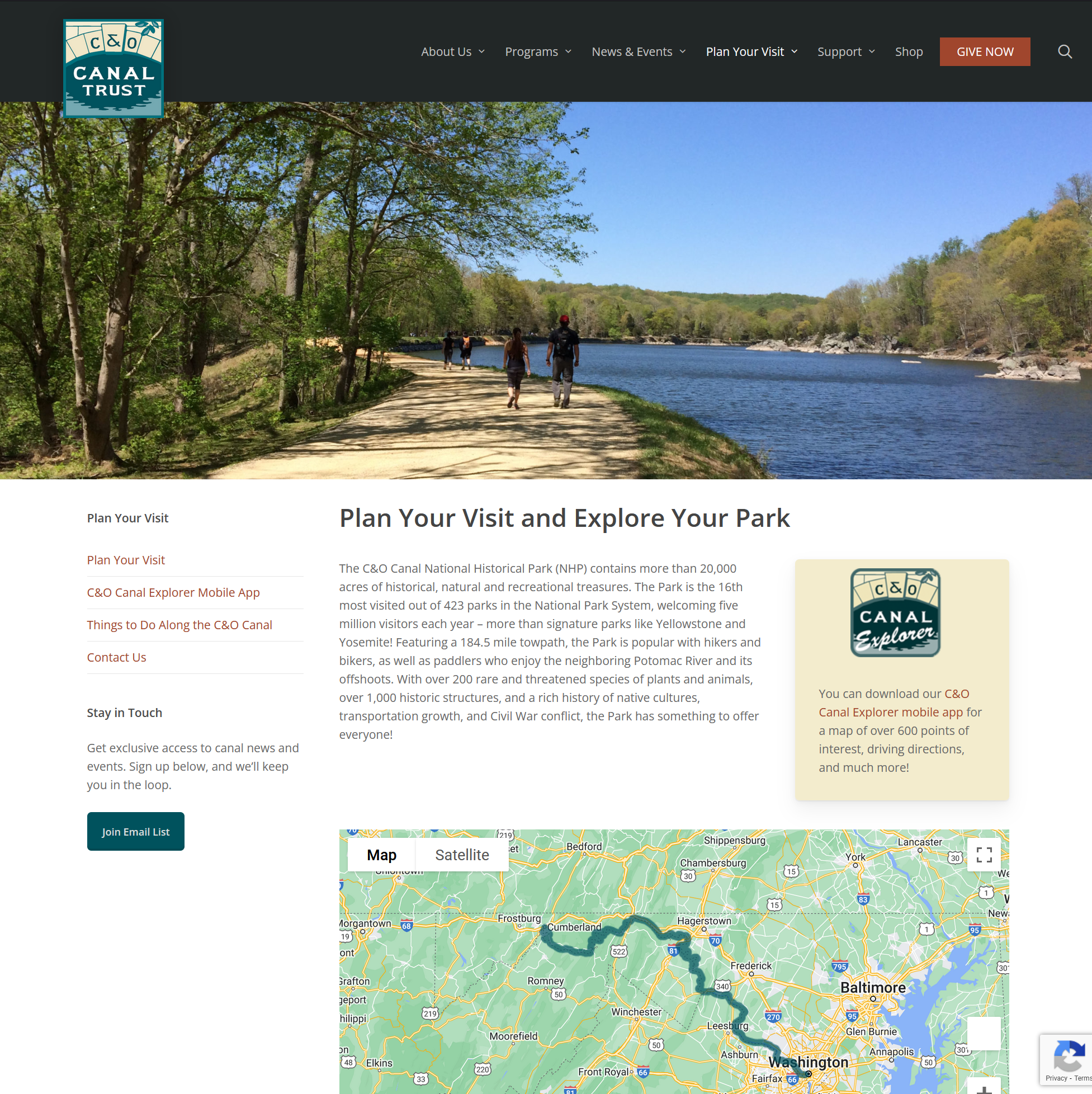
Below is an image of the first page of the Plan Your Visit section of the website.
C&O Canal Trust website
User Research
To understand the problem, I focused my research on four key questions.
How aware are park visitors of the C&O Canal Trust?
Which park visitors are more likely to use the mobile app or Plan Your Visit tools available on the Trust’s website?
What pain points do park visitors have when planning a visit?
How/why are visitors confusing the roles of the Trust versus the NPS?
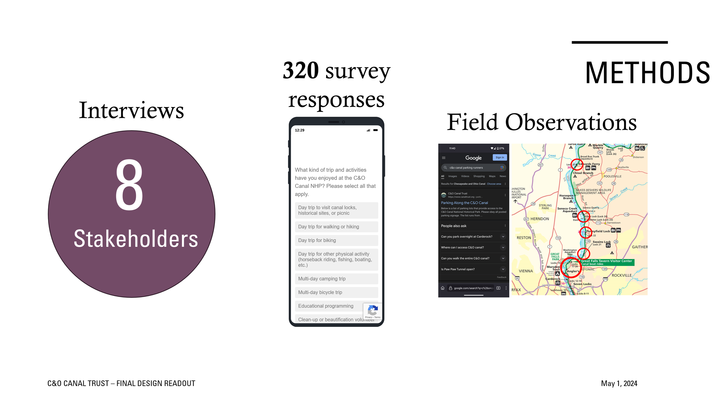
My primary research came from interviews, including staff, long-time park visitors and volunteers, and local business owners, as well as a survey distributed through various online forums and enthusiast groups. I also visited several location along the canal.

Interview coding in Miro
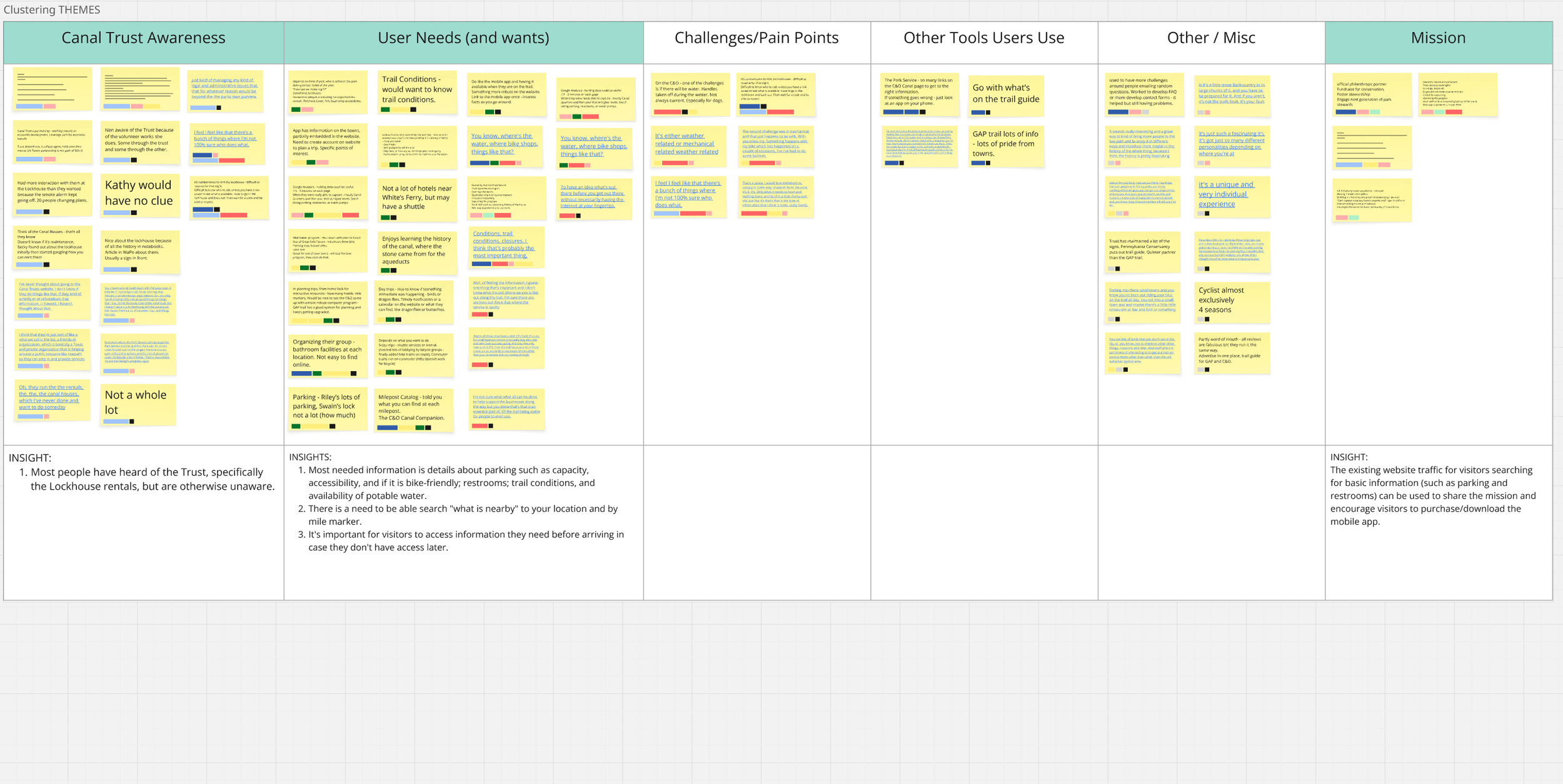
Clustering interview notes to determine themes
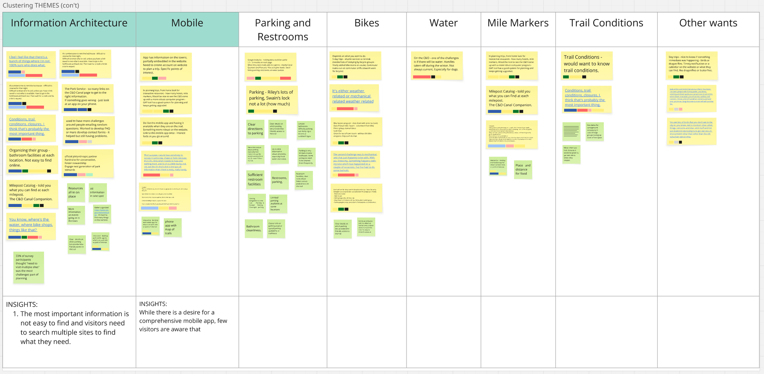
Clustering into themes
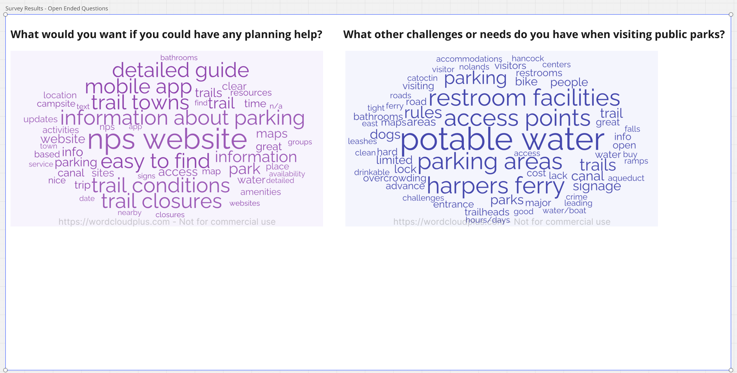
Word clouds from two open-ended survey questions. Most survey questions were multiple choice.
Key Insights
Overall awareness of the Trust and its mission is low.
Only 49% of survey respondents thought the Trust provided fundraising.
Mobile app has low awareness but high demand.
Over 50% of respondents were aware the Trust provided trip planning tools, but only 25% were aware of the app. Both interviewees and survey respondents expressed a desire for a mobile app. There is an opportunity to increase downloads.
Visitors are mostly looking for practical logistical information.
Parking capacity, restrooms, accessibility, bike friendliness, trail conditions, and availability of potable water were most important for visitors.
Park information is generally difficult for visitors to find.
Visitors are searching multiple sites to find what they need, usually through a Google search
I also found another key insight that shifted my thinking about how to solve the problem. For a visitor doing a Google search—for example, parking along the canal—the Trust’s website tops search results for that particular location, above the NPS website.
Therefore, individual location pages in the Trust’s website are a likely entry point for visitors making a plan for a simple day trip (which is most visitors.)
Once on the website, they may be mistaking it for the NPS website. By focusing the solution specifically on the individual location pages, we could leverage the Trust’s existing SEO to address the problem.
“Our role is not to be a tourism partner but to leverage funds and communicate ways to support the park—ensure people download our app because that helps them support us.”
— Tymber Compher, C&O Canal Trust Marketing Communications Manager
Moving Toward A Solution
With key visitor insights and a focus on the location pages, I refined the problem statement:
How might we provide visitors with quick and easy access to the information they need so they can be encouraged to support the C&O Canal Trust’s mission and download the mobile app?
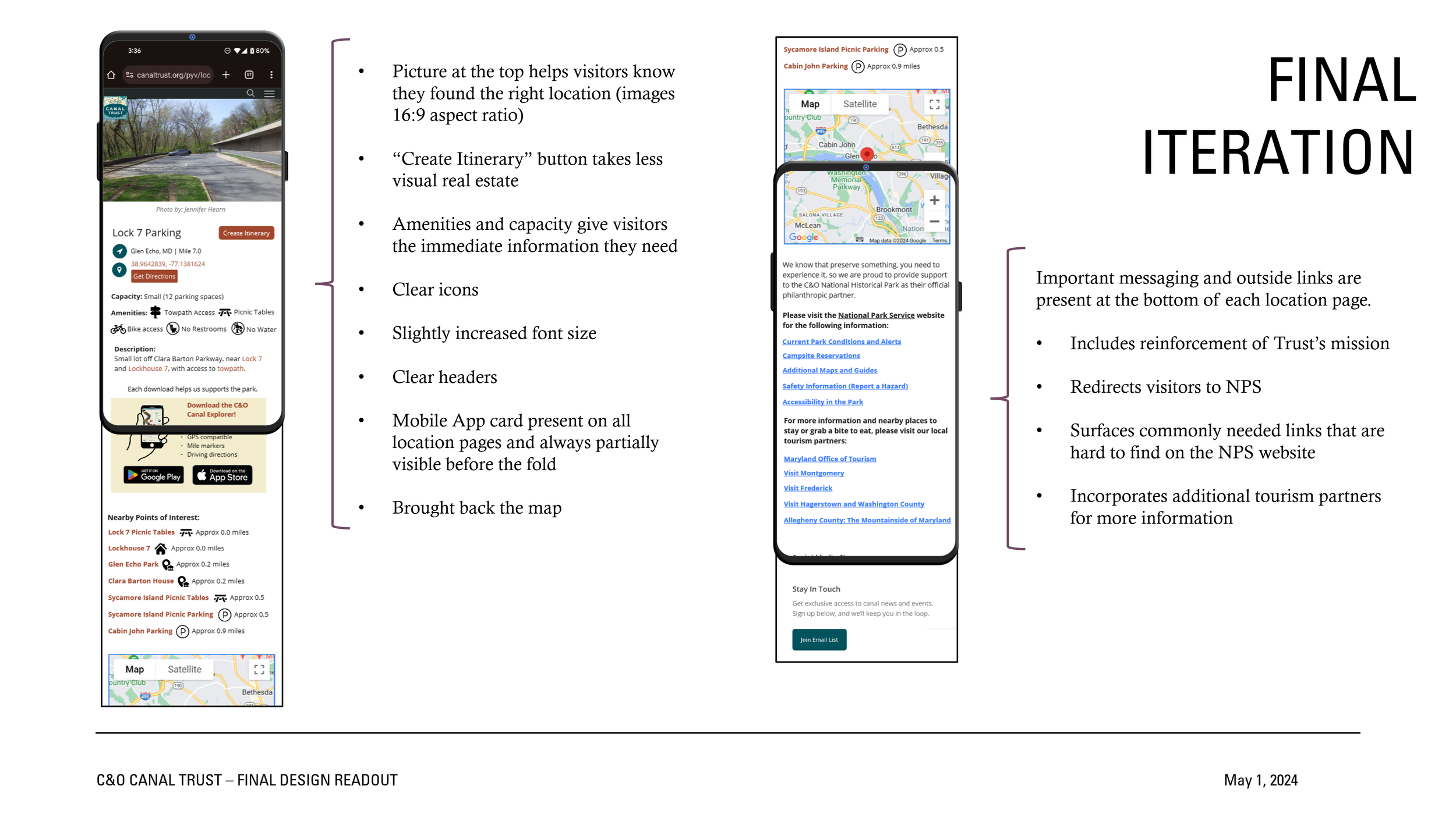
The idea was that if a location page is the first thing a visitor encounters when planning a trip, it should give them the key information they need, direct them to the appropriate outside sources before they call the wrong organization, and encourage their support.
Additionally, I wanted to make sure I was providing the client with a feasible solution and guidance that was:
Simple to integrate into the existing system
High impact, but minimal effort
Focused on structure of information and less on aesthetics (which will be addressed in their planned brand redesign)
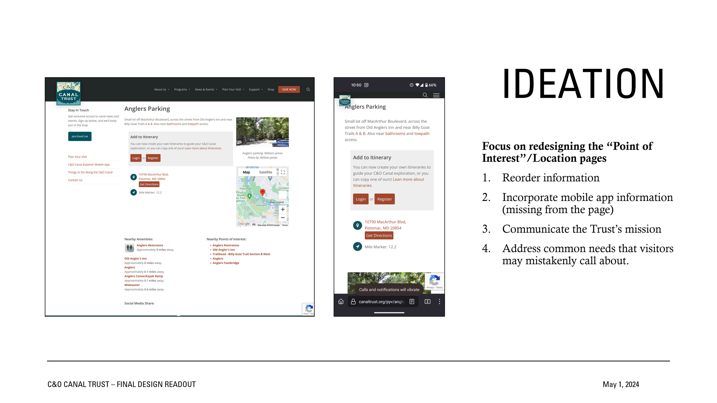
The slide below shows how each location in the database is displayed on the existing website. Optimizing the design for mobile display was also a priority.
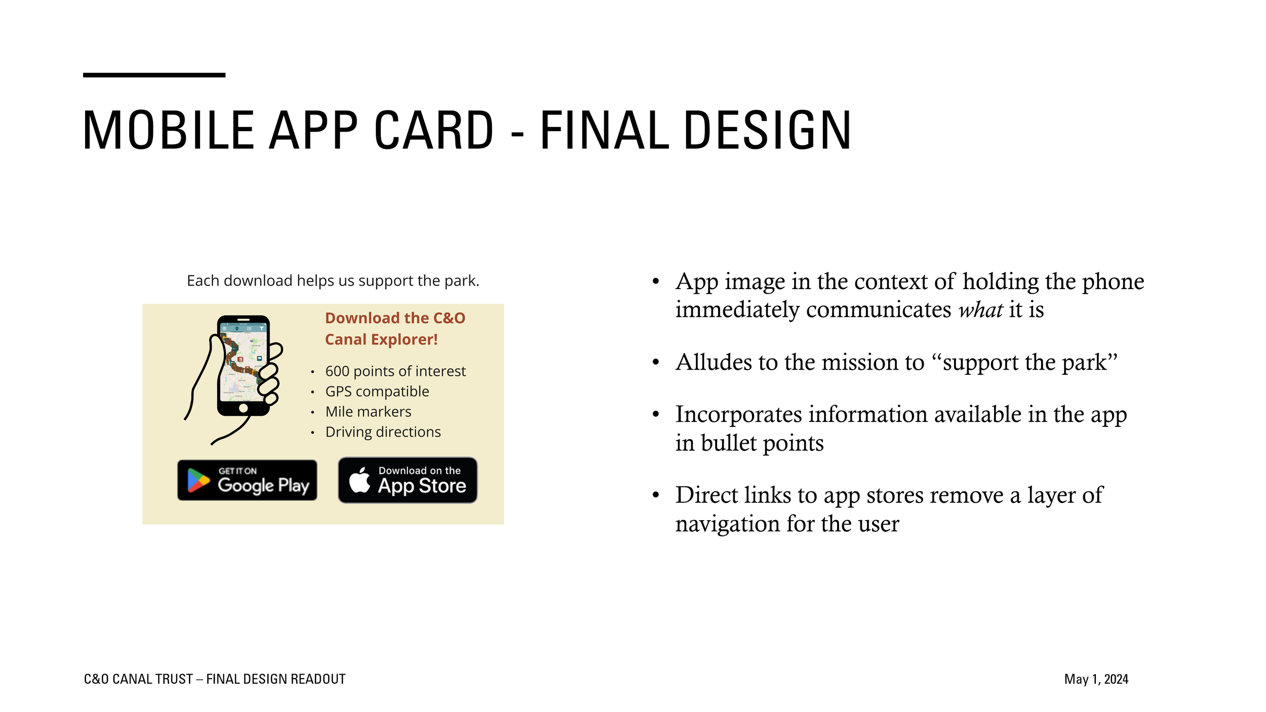
Redesigning the Mobile App Card
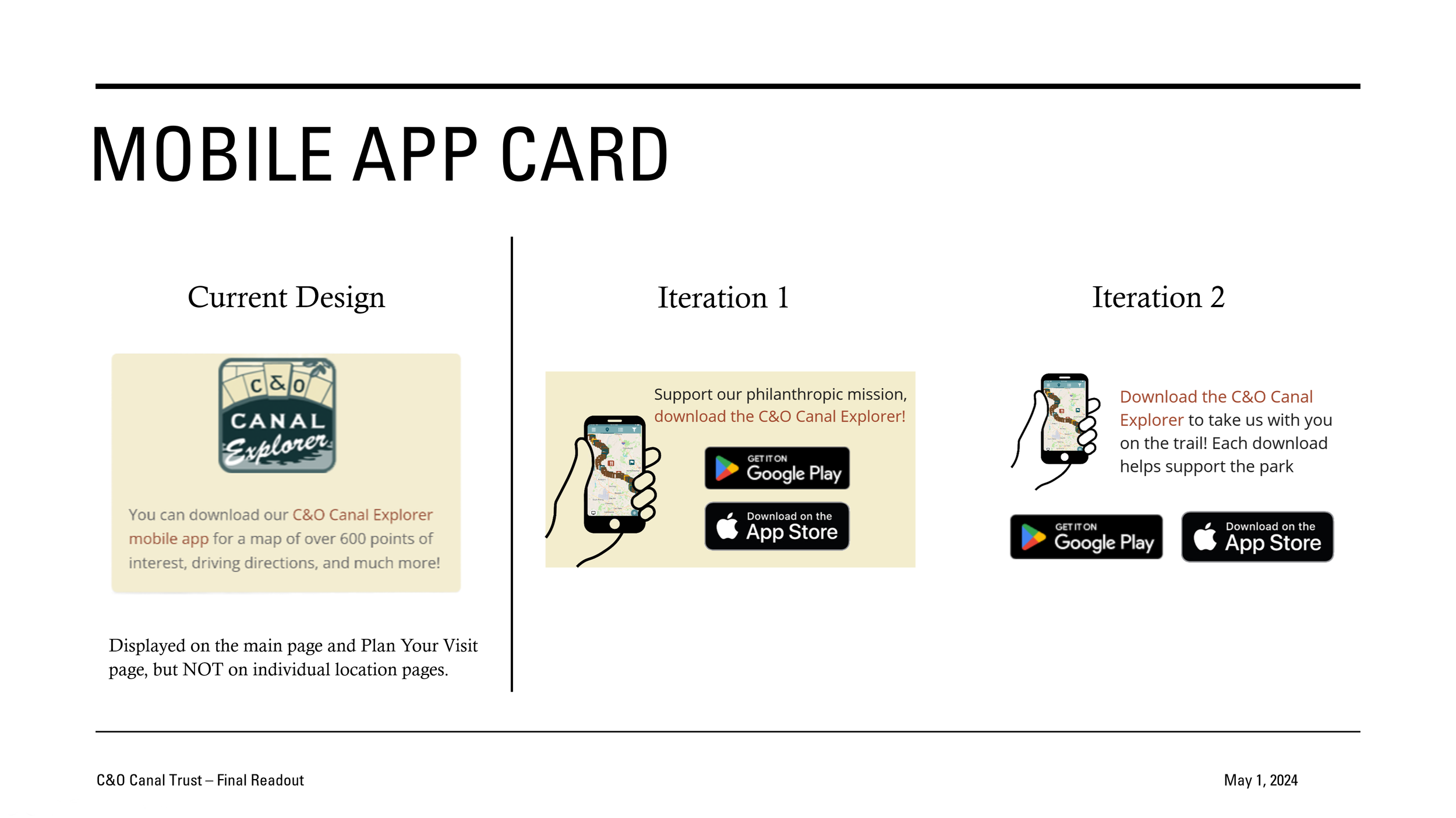
The mobile app supports the client’s mission through a small fee per download. Along with more prominent positioning, a redesign was critical to better communicate what it is, what it provides, and how it supports the Trust’s philanthropic mission. I also wanted to remove a layer of navigation to facilitate downloads.
User feedback found the first two iterations either felt too much like an advertisement or didn’t clearly show the benefits, causing users to look past it. The final iteration improved this and drew interest from testers.
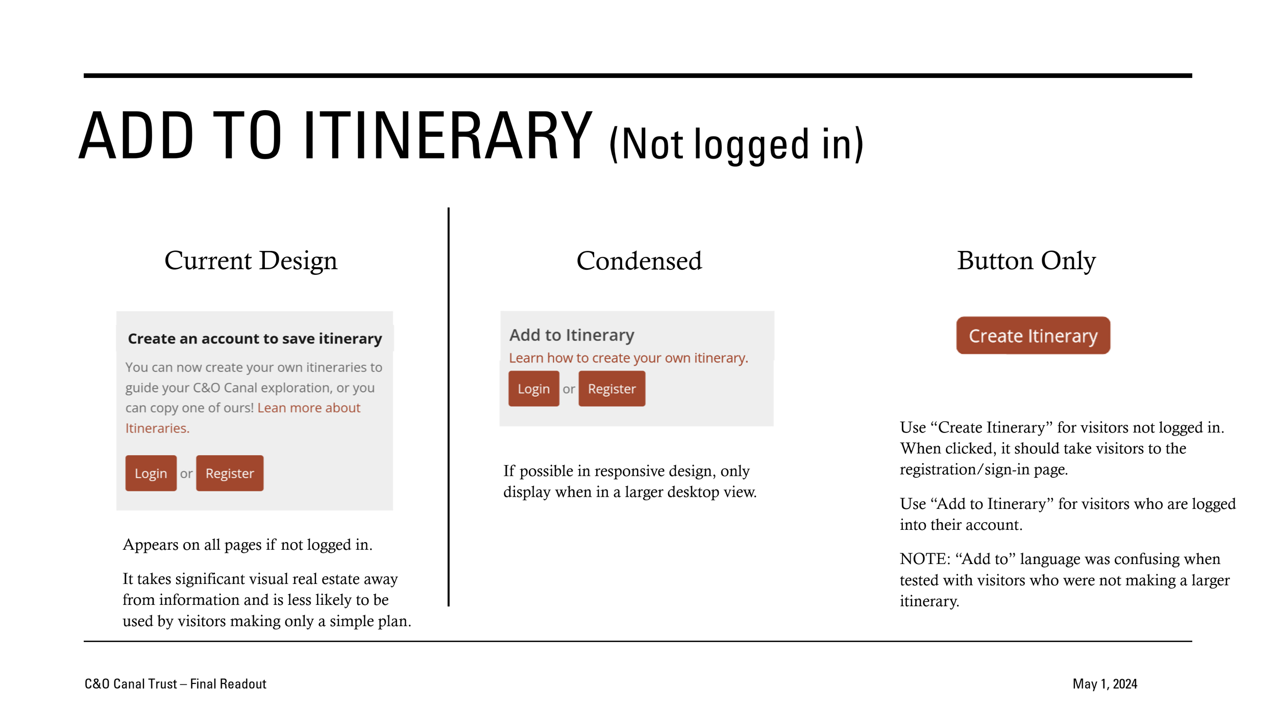
Condensing the “Create Itinerary” Feature
The current design includes a large block to create an account and save a location to an itinerary. While this is useful for more detailed planners, it doesn’t serve the majority of visitors who make only a simple plan (which was most survey respondents.) This also takes up real estate on the screen, pushing more important information below the fold on mobile. I wanted to condense and simplify this block and provide a smaller option for mobile.
Full Design Iteration and User Testing
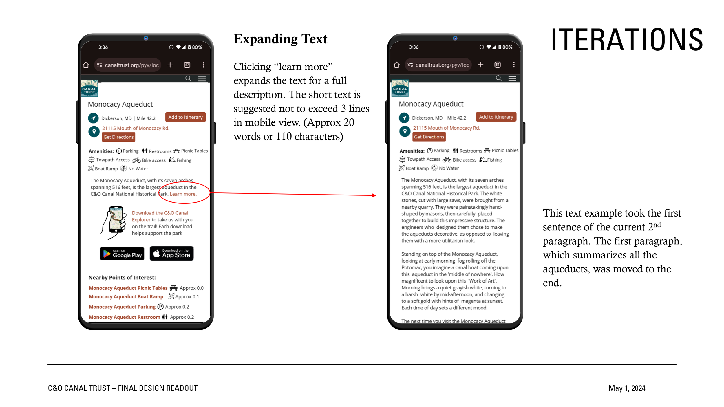
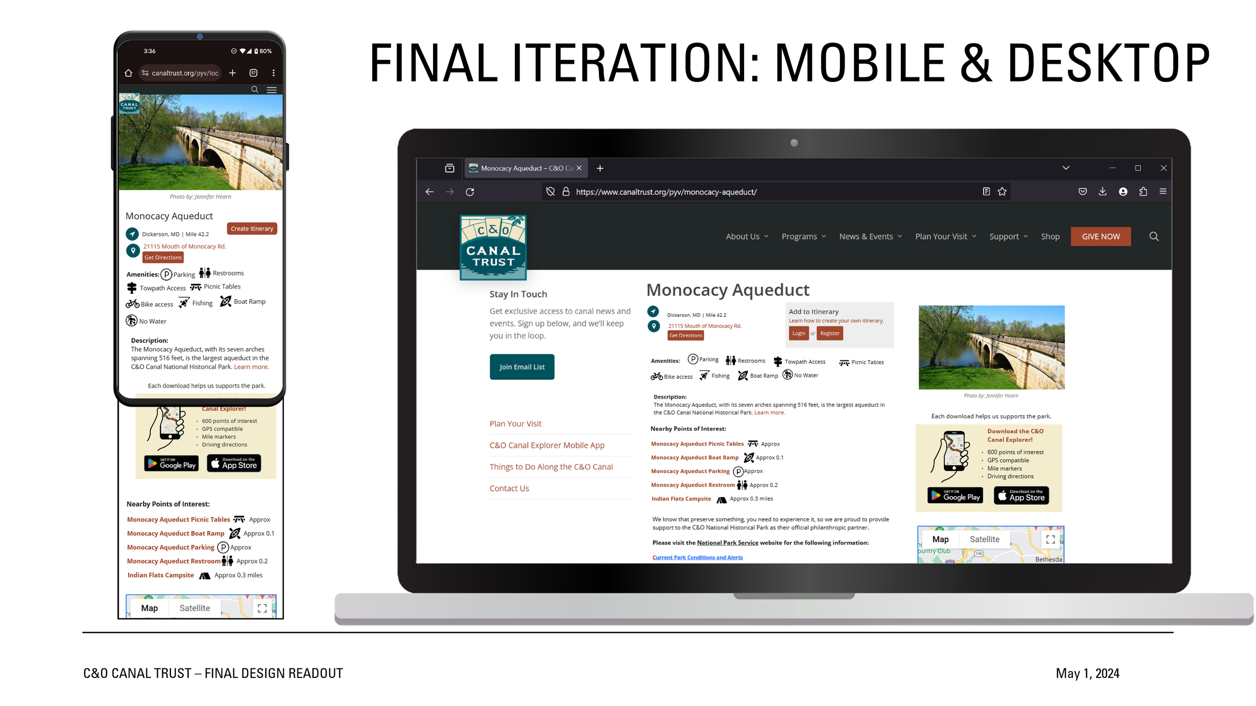
The redesign of the full page focused on information architecture and content design. I wanted to make sure the most important information was up top and clear. This involved adding clearer headers and icons, additional details, and collapsing large blocks of text into an expandable “learn more” link. Each iteration was user tested with at least five testers, including one of the interview subjects.

“If you want people to preserve something, they need to experience it.”
— Lauren Riviello

